This short guide aims to help support users of the Observatory to interpret the data displayed on the site, particularly when using the data toolbox features. Click on the headings below, or choose ‘expand all’ to read more.
Data sources
Data in the site is sourced from numerous national, validated data sources such as the Office for National Statistics (ONS) and the Office for Health Improvement and Disparities’ (OHID) Fingertips data profiles. Data feeds into the Observatory directly from these sources and is, therefore, as up to date as the data provided on the publisher’s site.
Data has been selected as being of the highest quality including those deemed as Official National Statistics. National data sources allow for comparison of the local area against benchmarks such as the National, and regional averages aiding the interpretation of data. Data is also collected at regular time intervals allowing us to monitor trends in data.
Even when using the most robust data sources available, data will vary in terms of its accuracy and completeness, and this should be considered when interpreting the data. Understanding the strengths and limitations of the data is important. This is discussed in more detail below under ‘Data Interpretation’.
For more detailed assessments of need, local data collections, and qualitative data (data which is often non-numerical and more descriptive in nature, sometimes referred to as ‘soft intelligence’) should also be considered alongside the data available on the Observatory. These data sources both aid the interpretation of local patterns seen within nationally collected statistics and provide a greater depth of local insight.
Statistics used
Data analysis is the process of ordering, categorizing, manipulating, and summarizing data to obtain reach a conclusion. The following ways of summarising data are most used in the Observatory:
- Counts – these may be referred to as the numerator and is a simple count of the event of interest (e.g., number of people with a diagnosis of dementia)
- Denominator – this is the total of the population group of interest (e.g., the number of people aged 65 and over)
- Proportion – this is number of events occurring within the population of interest expressed as a percentage (E.g., the number of people with a diagnosis of dementia DIVIDED BY the number of people aged 65 and over MULTIPLED BY 100)
- Rate – the number of events occurring with the population of interest expressed by a specified multiplier. These are often used where the number of events a relatively low given the size of the population of interest (E.g., the number of people with a diagnosis of HIV DIVIDED BY the total population and over MULTIPLED BY 100,000)
- Averages – there are several ways of calculating and average, the most used is the mean. The mean of an array of numbers sums all together and then divides by the number of values. Another common way to average numbers is to take the median value: this is the middle value when all numbers are sorted in order. The mode is the number that appears most often in an set of values.
- Standardised Rates/Ratios – a factor that often influences the likelihood of an event occurring in a population is its age/sex structure. For example, many diseases such as cancer and hear disease are more likely to occur as people age. If a population has more older people than another than you would expect these conditions to occur more frequently. To control for this, and to identify whether there are differences between populations that cannot be explained by age/sex differences, standardised rates are used. Depending on the calculation used, these are referred to as Directly Standardised Rates or Indirectly Standardised Ratios.
Visualisations used
Tables: A table is a visual display of data arranged into rows and columns. One benefit of using tables is that they allow us to demonstrate several patterns or differences between groups, depending on what data are included in the table.
Line Graphs: A line graph is a useful data presentation tool for showing a long series of data (such as disease trends over time). Line graphs are also useful for comparing several different series of data in the same graph. Line graphs display data in two dimensions. We call the dimensions the x-axis and the y-axis. When reading a line graph, you’ll notice that rises and falls in the line show how one variable is affected by another.
Bar Graphs: Bar graphs are also used to compare data and show relationships between two or more variables (or groups or items). Each independent variable is discrete, such as race or gender (which only has two categories: male and female). Bar graphs are a quick and intuitive way to show big differences in data. Bar charts can have a vertical layout or a horizontal layout.
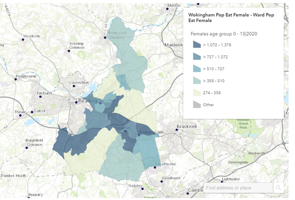
Maps: Maps are useful ways of presenting data that is available at lower levels of geography such as Electoral Wards. You can quickly see patterns based on the categorisation of data into ordered groups which are indicated by different depths of colour shading. They are particularly useful for showing information in relation to other geographical features such as roads. They will also indicate “clustering” where something is more prevalent in several areas that are in proximity.
Data interpretation
Data analysis and visualisation are only the first steps in taking and conclusions away from the data in front of us. Interpreting data is not always an easy task. We may see some quite striking patterns in the data which, in statistical terms, do not mean a great deal. On the other hand, there may be some quite meaningful patterns in data which are very subtle and not as striking when presented on a chart.
To help interpret data, we suggest the following tips:
- Be questioning of the data
- Go beyond the title and look at the provided metadata
- Where does it come from?
- How old is it?
- Is it based on a survey or on whole population counts?
- Ask yourself if you know enough about the topic to make reliable interpretations
- If you can, speak to someone who knows the topic well
- Read up on the topic online
- Are there any examples of others using the data that can help you?
- Perhaps another area has published a recent needs assessment on the topic
- Are you seeing small numbers?
- Data based on small numbers is prone to error: small changes can appear as big differences over time or between areas. Always question any differences if underlying numbers are small. As a rule, local authority level data (based on approximately 150,000 total population) data will be less prone to error and LSOA level data (based on approximately 1,000 people) the most prone
- Look at a line chart of the data overtime, data based on small numbers will often show as bouncing up and down overtime. Compare it to the same data for a larger area (e.g., England), is the line now more stable?
- Measures of statistical confidence can be placed around statistics to support interpretation of small numbers. These are discussed more below
- Add in some context
- Is there something about the local area that may affect what you are seeing?
- Always start any assessment by looking at the general population characteristics of the areas you are looking at and think about:
- The population size and structure (particularly age)
- Levels of deprivation
- How densely populated it is
- Have a look at the JSNA summary reports if you are not familiar with the local area
- Always start any assessment by looking at the general population characteristics of the areas you are looking at and think about:
- Is there something about the local area that may affect what you are seeing?
- Where possible, look at several time points of data to ask:
- Is there a consistent pattern?
- If an area has data that is consistently above or below average, or is showing steady rises or declines, then this indicates a reliable trend
- If there is a sudden jump or drop, ask yourself if there may be a reason for this (e.g., covid-19 will have affected how some data is collected)
- Is there a consistent pattern?
Confidence intervals
Confidence intervals show the level of uncertainty we have around a particular statistic. Each statistic will have an upper and a lower confidence interval. Confidence interval calculations consider the size of the denominator, the degree of variability in the data, and the level of confidence we want to have in the statistic.
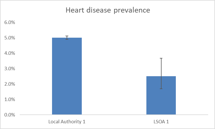
Confidence intervals are often represented on charts using error bars such as those shown in the example below.
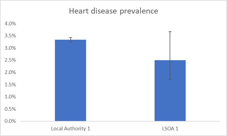
In the example above, the denominators used are those of a local authority in Berkshire and a LSOA in Berkshire. This demonstrates how we can be a lot less confident around statistics based on smaller populations, such as those found in LSOAs. This can be seen by the much larger error bar showing on the LSOA bar of the chart.
We can use the upper and lower confidence intervals to determine if a difference between areas or groups of people, or changes over time are statistically significant. This means that the differences are not due to chance or error. We do this by seeing if there is any overlap of error bars. In the example chart shown above we would determine that, although the LSOA has a lower prevalence of heart disease than the local authority, this difference is not statistically significant. We would say this because the error bars overlap. In the example below, the difference between the local authority and the LSOA heart disease prevalence is great enough that the error bars do not overlap. In this instance, we can say that the heart disease prevalence in the LSOA is statistically significantly lower than the local authority prevalence.